Guest post by Gergely Daróczi. If you like this content, you can buy the full 396 paged e-book for 5 USD until January 8, 2016 as part of Packt’s “$5 Skill Up Campaign” at https://bit.ly/mastering-R
Feature extraction tends to be one of the most important steps in machine learning and data science projects, so I decided to republish a related short section from my intermediate book on how to analyze data with R. The 9th chapter is dedicated to traditional dimension reduction methods, such as Principal Component Analysis, Factor Analysis and Multidimensional Scaling — from which the below introductory examples will focus on that latter.
Multidimensional Scaling (MDS) is a multivariate statistical technique first used in geography. The main goal of MDS it is to plot multivariate data points in two dimensions, thus revealing the structure of the dataset by visualizing the relative distance of the observations. Multidimensional scaling is used in diverse fields such as attitude study in psychology, sociology or market research.
Although the MASS package provides non-metric methods via the isoMDS function, we will now concentrate on the classical, metric MDS, which is available by calling the cmdscale function bundled with the stats package. Both types of MDS take a distance matrix as the main argument, which can be created from any numeric tabular data by the dist function.
But before such more complex examples, let’s see what MDS can offer for us while working with an already existing distance matrix, like the built-in eurodist dataset:
> as.matrix(eurodist)[1:5, 1:5]
          Athens Barcelona Brussels Calais Cherbourg
Athens         0      3313     2963   3175      3339
Barcelona   3313         0     1318   1326      1294
Brussels    2963      1318        0    204       583
Calais      3175      1326      204      0       460
Cherbourg   3339      1294      583    460         0
The above subset (first 5-5 values) of the distance matrix represents the travel distance between 21 European cities in kilometers. Running classical MDS on this example returns:
> (mds <- cmdscale(eurodist))
                      [,1]      [,2]
Athens           2290.2747  1798.803
Barcelona        -825.3828   546.811
Brussels           59.1833  -367.081
Calais            -82.8460  -429.915
Cherbourg        -352.4994  -290.908
Cologne           293.6896  -405.312
Copenhagen        681.9315 -1108.645
Geneva             -9.4234   240.406
Gibraltar       -2048.4491   642.459
Hamburg           561.1090  -773.369
Hook of Holland   164.9218  -549.367
Lisbon          -1935.0408    49.125
Lyons            -226.4232   187.088
Madrid          -1423.3537   305.875
Marseilles       -299.4987   388.807
Milan             260.8780   416.674
Munich            587.6757    81.182
Paris            -156.8363  -211.139
Rome              709.4133  1109.367
Stockholm         839.4459 -1836.791
Vienna            911.2305   205.930
These scores are very similar to two principal components (discussed in the previous, Principal Component Analysis section), such as running prcomp(eurodist)$x[, 1:2]. As a matter of fact, PCA can be considered as the most basic MDS solution.
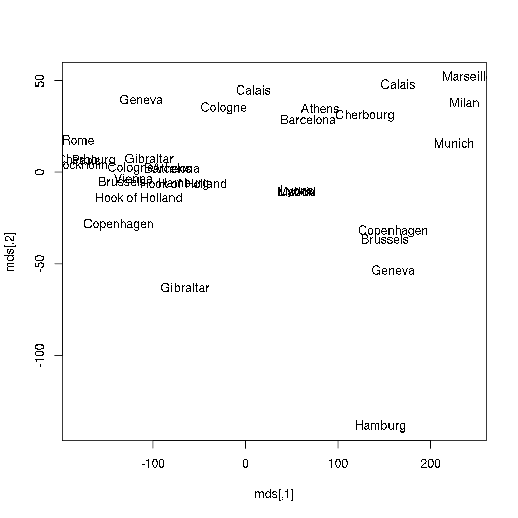
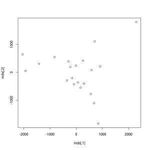
Anyway, we have just transformed (reduced) the 21-dimensional space into 2 dimensions, which can be plotted very easily — unlike the original distance matrix with 21 rows and 21 columns:
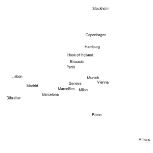
> plot(mds)Does it ring a bell? If not yet, the below image might be more helpful, where the following two lines of code also renders the city names instead of showing anonymous points:
> plot(mds, type = 'n')
> text(mds[, 1], mds[, 2], labels(eurodist))-1), but we have just rendered a map of some European cities from the distance matrix — without any further geographical data. I hope you find this rather impressive!Please find more data visualization tricks and methods in the 13th, Data Around Us chapter, from which you can learn for example how to plot the above results over a satellite map downloaded from online service providers. For now, I will only focus on how to render this plot with the new version of ggplot2 to avoid overlaps in the city names, and suppressing the not that useful x andy axis labels and ticks:
> library(ggplot2)
> ggplot(as.data.frame(mds), aes(V1, -V2, label = rownames(mds))) +
+     geom_text(check_overlap = TRUE) + theme_minimal() + xlab('') + ylab('') +
+     scale_y_continuous(breaks = NULL) + scale_x_continuous(breaks = NULL)
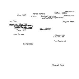
But let’s get back to the original topic and see how to apply MDS on non-geographic data, which was not prepared to be a distance matrix. We will use the mtcars dataset in the following example resulting in a plot with no axis elements:
> mds <- cmdscale(dist(mtcars))
> plot(mds, type = 'n', axes = FALSE, xlab = '', ylab = '')
> text(mds[, 1], mds[, 2], rownames(mds))
The above plot shows the 32 cars of the original dataset scattered in a two dimensional space. The distance between the elements was computed by MDS, which took into account all the 11 original numeric variables, and it makes vert easy to identify the similar and very different car types. We will cover these topics in more details in the next chapter, which is dedicated toClassification and Clustering.
This article first appeared in the “Mastering Data Analysis with R” book, and is now published with the permission of Packt Publishing.


