I am pleased to announce heatmaply, my new R package for generating interactive heat maps, based on the plotly R package.
tl;dr
By running the following 3 lines of code:
install.packages("heatmaply")
library(heatmaply)
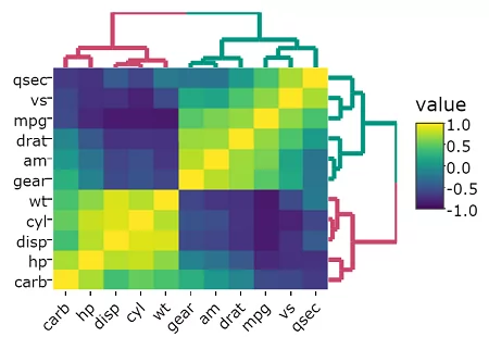
heatmaply(mtcars, k_col = 2, k_row = 3) %>% layout(margin = list(l = 130, b = 40))
You will get this output in your browser (or RStudio console):
You can see more example in the online vignette on CRAN. For issue reports or feature requests, please visit the GitHub repo.
Introduction
A heatmap is a popular graphical method for visualizing high-dimensional data, in which a table of numbers are encoded as a grid of colored cells. The rows and columns of the matrix are ordered to highlight patterns and are often accompanied by dendrograms. Heatmaps are used in many fields for visualizing observations, correlations, missing values patterns, and more.
Interactive heatmaps allow the inspection of specific value by hovering the mouse over a cell, as well as zooming into a region of the heatmap by draging a rectangle around the relevant area.
This work is based on the ggplot2 and plotly.js engine. It produces similar heatmaps as d3heatmap, with the advantage of speed (plotly.js is able to handle larger size matrix), the ability to zoom from the dendrogram (thanks to the dendextend R package), and the possibility of seeing new features in the future (such as sidebar bars).
Why heatmaply
The heatmaply package is designed to have a familiar features and user interface as heatmap, gplots::heatmap.2 and other functions for static heatmaps. You can specify dendrogram, clustering, and scaling options in the same way. heatmaply includes the following features:
- Shows the row/column/value under the mouse cursor (and includes a legend on the side)
- Drag a rectangle over the heatmap image, or the dendrograms, in order to zoom in (the dendrogram coloring relies on integration with the dendextend package)
- Works from the R console, in RStudio, with R Markdown, and with Shiny
The package is similar to the d3heatmap package (developed by the brilliant Joe Cheng), but is based on the plotly R package. Performance-wise it can handle larger matrices. Furthermore, since it is based on ggplot2+plotly, it is expected to have more features in the future (as it is more easily extendable by also non-JavaScript experts). I choose to build heatmaply on top of plotly.js since it is a free, open source, JavaScript library that can translate ggplot2 figures into self-contained interactive JavaScript objects (which can be viewed in your browser or RStudio).
The default color palette for the heatmap is based on the beautiful viridis package. Also, by using the dendextend package (see the open-access two-page bioinformatics paper), you can customize dendrograms before sending them to heatmaply (via Rowv and Colv).
You can see some more eye-candy in the online Vignette on CRAN, for example:
For issue reports or feature requests, please visit the GitHub repo.

thanks, nice lovely package
Thanks. 🙂