dendextend version 1.0.1 + useR!2015 presentation

When using the dendextend package in your work, please cite it using:

Tal Galili (2015). dendextend: an R package for visualizing, adjusting, and comparing trees of hierarchical clustering. Bioinformatics. doi:10.1093/bioinformatics/btv428

My R package dendextend (version 1.0.1) is now on CRAN!

The dendextend package Offers a set of functions for extending dendrogram objects in R, letting you visualize and compare trees of hierarchical clusterings. With it you can (1) Adjust a tree’s graphical parameters – the color, size, type, etc of its branches, nodes and labels. (2) Visually and statistically compare different dendrograms to one another.

The previous release of dendextend (0.18.3) was half a year ago, and this version includes many new features and functions.

To help you discover how dendextend can solve your dendrogram/hierarchical-clustering issues, you may consult one of the following vignettes:

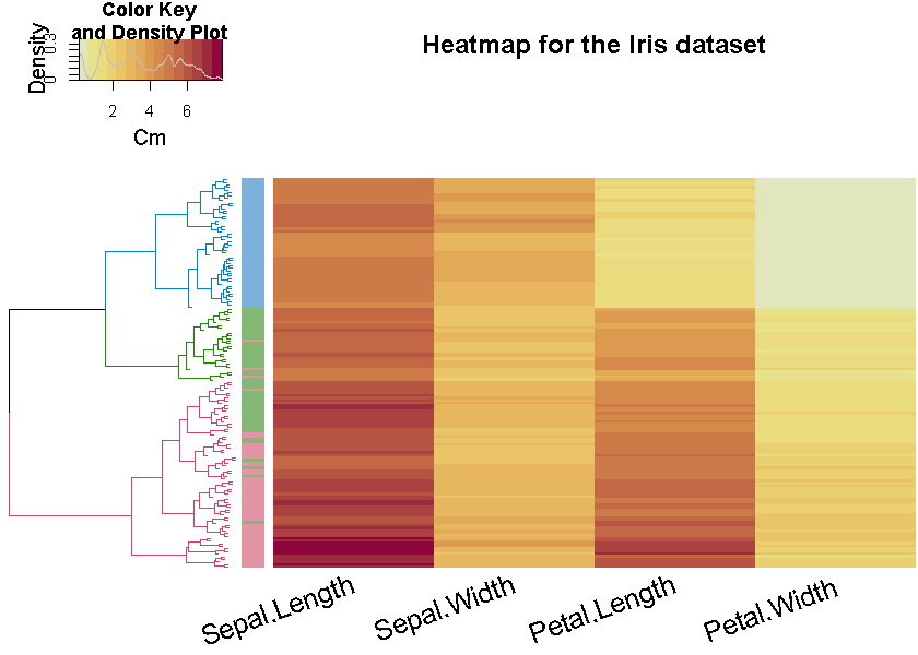
Here is an example figure from the first vignette (analyzing the Iris dataset)

iris_heatmap_dend


This week, at useR!2015, I will give a talk on the package. This will offer a quick example, and a step-by-step example of some of the most basic/useful functions of the package. Here are the slides:


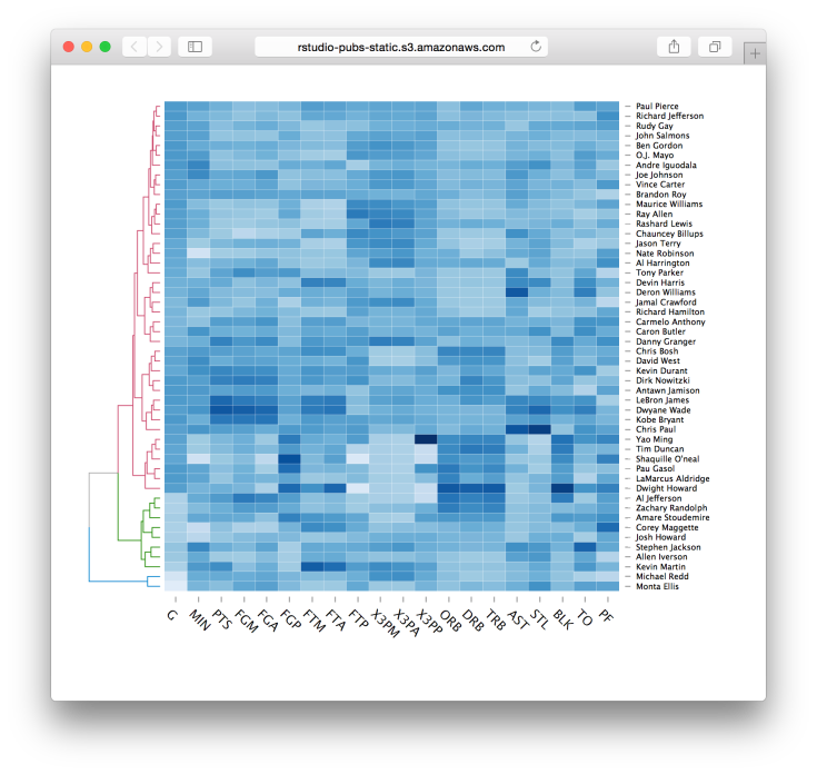
Lastly, I would like to mention the new d3heatmap package for interactive heat maps. This package is by Joe Cheng from Rstudio, and integrates well with dendrograms in general and dendextend in particular (thanks to some lovely github-commit-discussion between Joe and I). You are invited to see lively examples of the package in the post at the RStudio blog. Here is just one quick example:

d3heatmap(nba_players, colors = “Blues”, scale = “col”, dendrogram = “row”, k_row = 3)

d3heatmap

Israel’s 2015 election polls’ analysis with Shiny + ggplot2

(This is a guest post by my friend Yoni Sidi, a PhD candidate in statistics at the Hebrew University)

Background

The Israeli elections are coming up this Tuesday, 17/3/2015 (i.e.: tomorrow!). They are a bit more complicated than your average US presidential race. The elections in Israel are based on nationwide proportional representation. The electoral threshold is 3.25% and the number of seats (or mandates) out of a total of 120 is proportional to the number of votes it recieves, so the threshold roughly translates to at least four mandates. The Israeli system is a multi-party system and is based on coalition governments. Multi-party is putting it mildly, there are 11 that have a chance (and are expected) to pass the mandate threshold.
There are two major parties, Hamachane Hazioni (Left Wing) and the Likud (Right Wing), that are hoping to garner between 16%-25% of the votes, 20-30 mandates. The main winners though are the medium size parties that recomend to the President who they think has the best chance to construct the next government, so yes there is a good possibility that the general elections winner will not be one constructing the coalition. Making the actual winners the parties that create the biggest coalition which exceeds 60 mandates.
An abundance of polling has been continually published during the run up and the variaety of pollsters and publishers is hard to keep track of as a casual voter trying to gauge the temperature of the political landscape. I came across a great realtime database by Project 61 on google docs of past and present polling result information and decided that it was a great opportunity to learn the Shiny library of RStudio and create an app that I can check current and past results. So after I figured out how to connect google docs to R, I created a self updating app that became a nice place to keep track of polling every day, check trends and distributions using interactive ggplot2 graphs and simulate coalition outcomes.
Please note that as of Friday (March 13th), until election day (March 17th), it is forbidden to perform new polls in Israel, hence the data presented here cannot allow for an up-to-date inference about the expected results of the election. This post is for educational purposes.

Running the election polls Shiny app on your computer

The github repo is available here.

#changing locale to run on Windows
if (Sys.info()[1] == "Windows") Sys.setlocale("LC_ALL","Hebrew_Israel.1255") 

#check to see if libraries need to be installed
libs <- c("shiny","shinyAce","httr","XML","stringr","ggplot2","scales","plyr","reshape2","dplyr")
x <- sapply(libs,function(x)if(!require(x,character.only = T)) install.packages(x))
rm(x,libs)

#run App
shiny::runGitHub("Elections","yonicd",subdir="shiny")

#reset to original locale on Windows
if (Sys.info()[1] == "Windows") Sys.setlocale("LC_ALL")


Usage Instructions:

  1. Current Polling
  2. Election Analyis
  3. Mandate Simulator and Coalition Whiteboard
  4. Polling Database

Current Polling

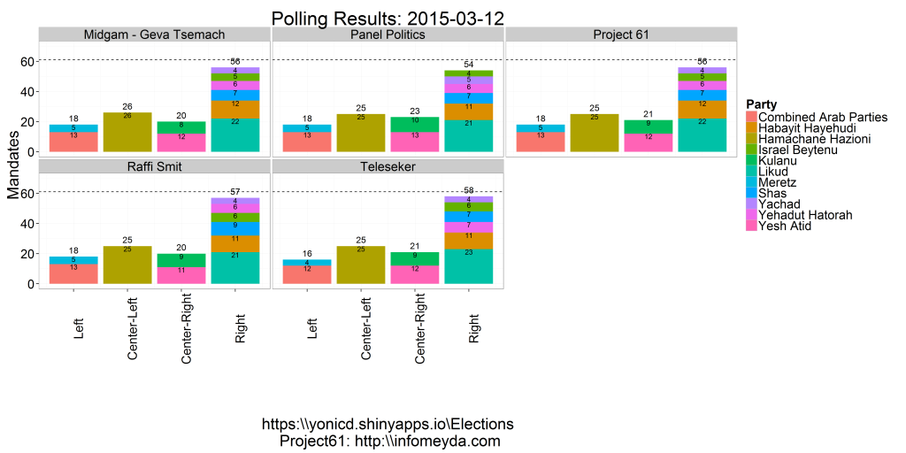
  • The latest polling day results published in the media and the prediction made using the Project 61 weighting schemes. The parties are stacked into blocks to see which block has best chance to create a coalition.

LastDayPlot

The Project 61 prediction is based past pollster error deriving weights from the 2003,2006,2009 and 2013 elections, dependant on days to elections and parties. In their site there is an extensive analysis on pollster bias towards certain parties and party blocks.

Election Analysis

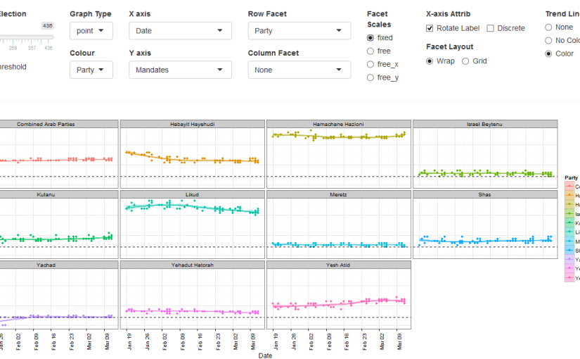
  • An interactive polling analysis layout where the user can filter elections, parties, publishers and pollster, dates and create different types of plots using any variable as the x and y axis.
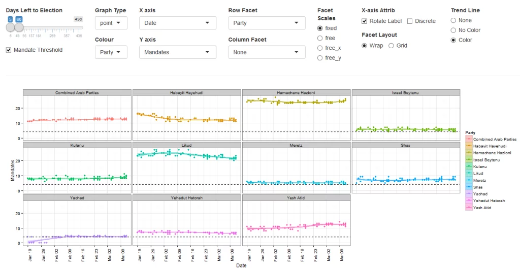
  • The default layer is the 60 day trend (estimated with loess smoother) of mandates published by each pollster by party

pad_screen_grab

The user can choose to include in the plots Elections (2003,2006,2009,2013,2015) and the subsequent filters are populated with the relevant parties, pollsters and publishers relevant to the chosen elections. Next there is a slider to choose the days before the election you want to view in the plot. This was used instead of a calendar to make a uniform timeline when comparing across elections.

In addition the plot itself is a ggplot thus the options above the graph give the user control on nearly all the options to build a plot. The user can choose from the following variables:

TimePartyResultsPoll
ElectionPartyMandatesPublisher
DaysLeftIdeology (5 Party Blocks)Mandate.GroupPollster
DateIdeology.Group (2 Party Blocks)Results
yearAttribute (Party History)(Pollster) Error
month
week

To define the following plot attributes:

Plot TypeAxesGroupingPlot Facets
PointX axis variableSplit Y by colors using a different variableRow Facet
BarDiscrete/ContinuousColumn Facet
LineRotation of X tick labels
StepY axis variable
Boxplot
Density
  • Create Facets to display subsets of the data in different panels (two more variables to cut data) there are two type of facets to choose from
    • Wrap: Wrap 1d ribbon of panels into 2d
    • Grid: Layout panels in a grid (matrix)

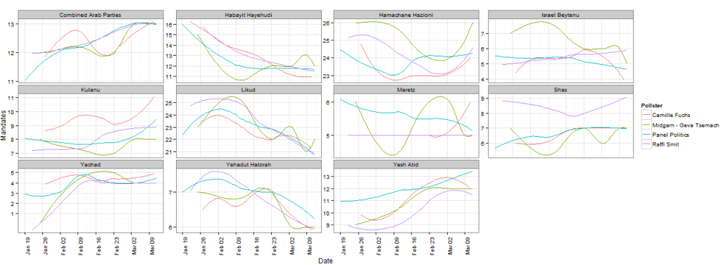
An example of filtering pollsters to compare different tendencies for each party in the 2015 elections:

ElectionPlot_pollster_trend

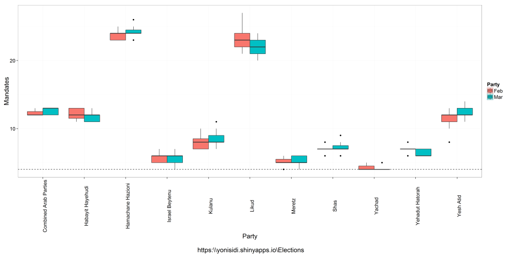
An example of comparing distribution mandates per party in the last two months of polling

boxplot_month

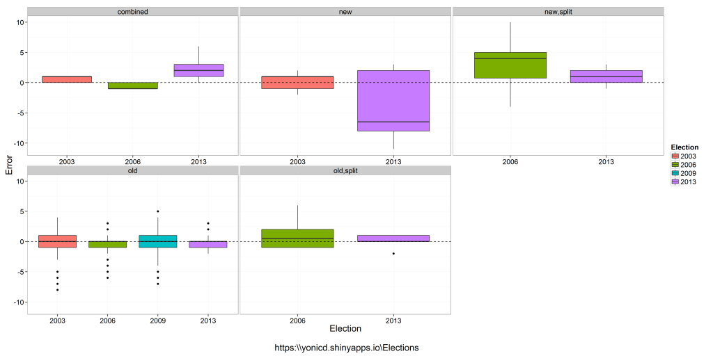
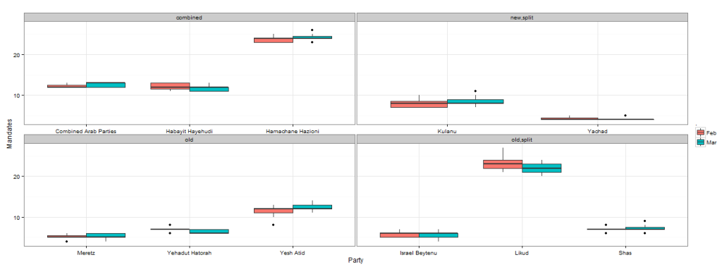
An example of comparing distribution of pollster errors across elections (up to 10 days prior end of polling), by splitting the parties into five groups compared to previous election: old party,new party, combined (combination of two or more old parties), new.split (new party created from a split of a party from last election), old.split (old party that was a left from the split).

ElectionPlot_longitudinal


As we can see the pollster do not get a good indication of new,new.split or combined parties, which could be a problem this election since there are: 3 combined, 2 new splits.

attribute_compare

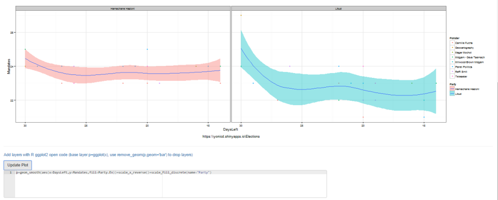
  • If you are an R user and know ggplot there is an additional editor console,below the plot, where you can create advanced plots freehand, just add to the final object from the GUI called p and the data.frame is x, eg p+geom_point(). Just notice that all aesthetics must be given they are not defined in the original ggplot() definition. It is also possible to use any library you want just add it to the top of the code, the end object must be a ggplot.

pad_screen_grab_ace


#new layer
p+geom_smooth(aes(x=DaysLeft,y=Mandates,fill=Party.En))+
scale_x_reverse()+scale_fill_discrete(name="Party")
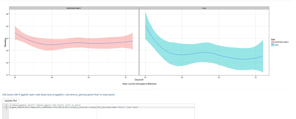
  • You can also remove the original layer if you want using the function remove_geom(ggplot_object,geom_layer), eg p=p+remove_geom(p,“point”) will remove the geom_point layer in the original graph

pad_screen_grab_ace_remove_geom

p=remove_geom(p,"point") #blank ggplot with facets in place
#new layer
p+geom_smooth(aes(x=DaysLeft,y=Mandates,fill=Party.En))+
scale_x_reverse()+scale_fill_discrete(name="Party")
  • Finally the plots can be viewed in English or Hebrew, and can be downloaded to you local computer using the download button.

Mandate Simulator and Coalition Whiteboard

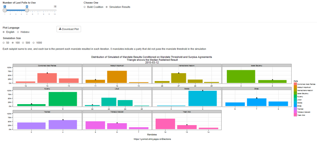
  • A bootstrap simulation is run on Polling results from up to 10 of the latest polls using the sampling error as the uncertainty of each mandate published. Taking into account mandate surplus agreements using the Hagenbach-Bischoff quota method and the mandate threshold limit (in this election it is 4 mandates), calculating the simulated final tally of mandates. The distributions are plotted per party and the location of the median published results in the media.
  • The user can choose how many polls to take into account, up to last 10 polls, and how big a simulation they want to run: 50,100,500,1000 random polling results per each party and poll.

sim_screen_grab

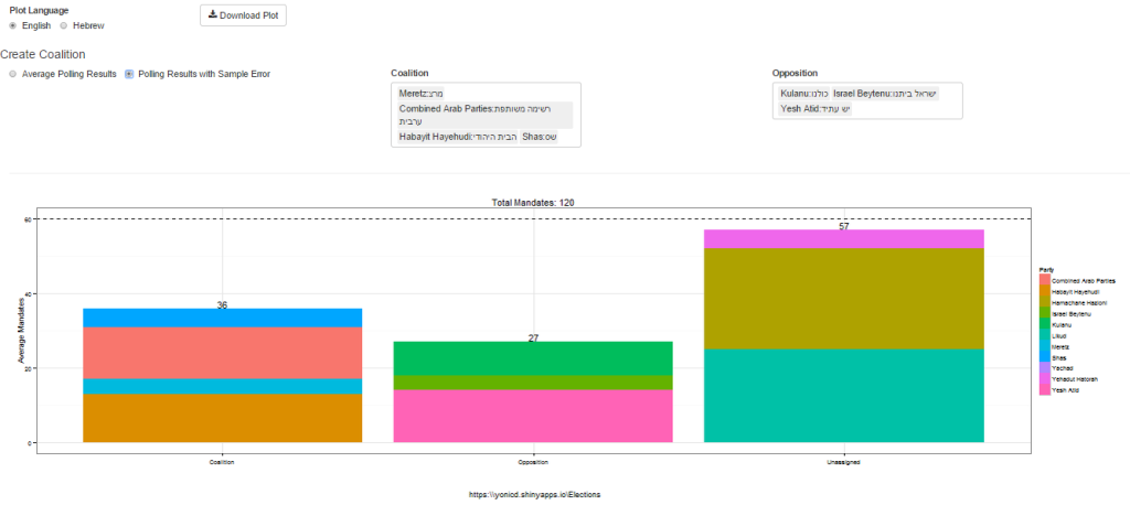
  • Once the simulator is complete you can create coalitions based on either the simulated distribution or actual published polls and see who can pass 60 mandates. Choose the coalition parties and the opposition parties from dropdown lists. (Yes the ones chosen are nonsensical on purpose…)

coal_screen_grab

Polling Database

  • All raw data used in the application can be viewed and filtered in a datatable.

The dendextend package for visualizing and comparing trees of hierarchical clusterings (slides from useR!2014)

When using the dendextend package in your work, please cite it using:

Tal Galili (2015). dendextend: an R package for visualizing, adjusting, and comparing trees of hierarchical clustering. Bioinformatics. doi:10.1093/bioinformatics/btv428

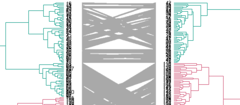
This week I presented in the useR!2014 my package dendextend (also on github), for easily manipulating, visualizing, and comparing dendrograms. Put simply, it is a package designed to easily create figures like these:

2015-06-28 20_58_26-Clipboard

Here is my presentation from useR:

[gview file=”https://www.r-statistics.com/wp-content/uploads/2014/07/2014-07-01-useR2014-03.pdf” profile=”null” save=”1″]

You are also invited to give a look to the current version of the package vignettes:

https://github.com/talgalili/dendextend/blob/master/vignettes/dendextend-tutorial.pdf

I highly welcome features suggestions and bug reports (or just “wow, this is awesome”) sent to my e-mail (tal.galili AT gmail.com), you can also leave a comment or use the github issue page.

A sidenote on useR!2014: this year’s useR conference was wonderful! I enjoyed the many talks, sessions, posters, and especially the so many wonderful R users I got to meet (and I will not try to list all of you – but you know who you are, and how much I enjoyed seeing you!). As corny as it may sound – we, the people who use R, are truly a community. There is a lot to be said about getting to meet so many people who share my own passion for statistical programming, open source, collaboration, open science, and a better future in general. Gladly, you can get a sense of what happened there by having a look at the twitter hashtag #useR2014. Several great R bloggers already started writing about it, you can see their posts here: 1, 2, 3, 4, 5. And I hope more posts will follow. I hope to see you in next year’s useR!2015!

Creating good looking survival curves – the 'ggsurv' function

This is a guest post by Edwin Thoen

Currently I am doing my master thesis on multi-state models. Survival analysis was my favourite course in the masters program, partly because of the great survival package which is maintained by Terry Therneau. The only thing I am not so keen on are the default plots created by this package, by using plot.survfit. Although the plots are very easy to produce, they are not that attractive (as are most R default plots) and legends has to be added manually. I come across them all the time in the literature and wondered whether there was a better way to display survival. Since I was getting the grips of ggplot2 recently I decided to write my own function, with the same functionality as plot.survfitbut with a result that is much better looking. I stuck to the defaults of plot.survfit as much as possible, for instance by default plotting confidence intervals for single-stratum survival curves, but not for multi-stratum curves. Below you’ll find the code of the ggsurv function. Just as plot.survfit it only requires a fitted survival object to produce a default plot. We’ll use the lung data set from the survival package for illustration. First we load in the function to the console (see at the end of this post).

Once the function is loaded, we can get going, we use the lung data set from the survival package for illustration.

library(survival)
data(lung)
lung.surv <- survfit(Surv(time,status) ~ 1, data = lung)
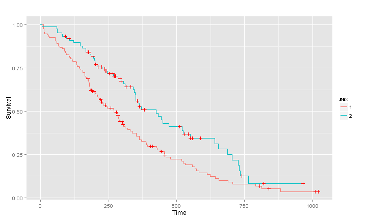
ggsurv(lung.surv)

unnamed-chunk-2

Continue reading "Creating good looking survival curves – the 'ggsurv' function"

Top 100 R packages for 2013 (Jan-May)!

What are the top 100 (most downloaded) R packages in 2013? Thanks to the recent release of RStudio of their “0-cloud” CRAN log files (but without including downloads from the primary CRAN mirror or any of the 88 other CRAN mirrors), we can now answer this question (at least for the months of Jan till May)!

By relying on the nice code that Felix Schonbrodt recently wrote for tracking packages downloads, I have updated my installr R package with functions that enables the user to easily download and visualize the popularity of R packages over time. In this post I will share some nice plots and quick insights that can be made from this great data. The code for this analysis is given at the end of this post.

Top 8 most downloaded R packages – downloads over time

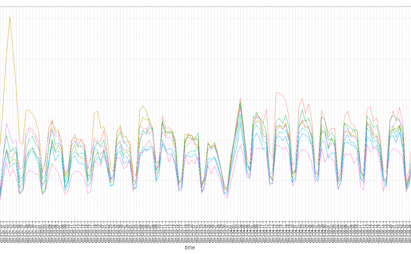
Let’s first have a look at the number of downloads per day for these 5 months, of the top 8 most downloaded packages (click the image for a larger version):

top_8_R_Packages_over_time

We can see the strong weekly seasonality of the downloads,  with Saturday and Sunday having much fewer downloads than other days. This is not surprising since we know that the countries which uses R the most have these days as rest days (see James Cheshire’s world map of R users). It is also interesting to note how some packages had exceptional peaks on some dates. For example, I wonder what happened on January 23rd 2013 that the digest package suddenly got so many downloads, or that colorspace started getting more downloads from April 15th 2013.

“Family tree” of the top 100 most downloaded R packages

We can extract from this data the top 100 most downloaded R packages. Moreover, we can create a matrix showing for each package which of our unique ids (censored IP addresses), has downloaded which package. Using this indicator matrix, we can thing of the “similarity” (or distance) between each two packages, and based on that we can create a hierarchical clustering of the packages – showing which packages “goes along” with one another.

With this analysis, you can locate package on the list which you often use, and then see which other packages are “related” to that package.  If you don’t know that package – consider having a look at it – since other R users are clearly finding the two packages to be “of use”.

Such analysis can (and should!) be extended. For example, we can imagine creating a “suggest a package” feature based on this data, utilizing the package which you use, the OS that you use, and other parameters.  But such coding is beyond the scope of this post.

Here is the “family tree” (dendrogram) of related packages:

Family_tree_of_Top_100_R_Packages

To make it easier to navigate, here is a table with links to the top 100 R packages, and their links:

Continue reading “Top 100 R packages for 2013 (Jan-May)!”

Interactive Graphics with the iplots Package (from “R in Action”)

The followings introductory post is intended for new users of R.  It deals with interactive visualization using R through the iplots package.

This is a guest article by Dr. Robert I. Kabacoff, the founder of (one of) the first online R tutorials websites: Quick-R. Kabacoff has recently published the book ”R in Action“, providing a detailed walk-through for the R language based on various examples for illustrating R’s features (data manipulation, statistical methods, graphics, and so on…). In previous guest posts by Kabacoff we introduced data.frame objects in R and dealt with the Aggregation and Restructuring of data (using base R functions and the reshape package).

For readers of this blog, there is a 38% discount off the “R in Action” book (as well as all other eBooks, pBooks and MEAPs at Manning publishing house), simply by using the code rblogg38 when reaching checkout.

Let us now talk about Interactive Graphics with the iplots Package:

Interactive Graphics with the iplots Package

The base installation of R provides limited interactivity with graphs. You can modify graphs by issuing additional program statements, but there’s little that you can do to modify them or gather new information from them using the mouse. However, there are contributed packages that greatly enhance your ability to interact with the graphs you create—playwith, latticist, iplots, and rggobi. In this article, we’ll focus on functions provided by the iplots package. Be sure to install it before first use.

While playwith and latticist allow you to interact with a single graph, the iplots package takes interaction in a different direction. This package provides interactive mosaic plots, bar plots, box plots, parallel plots, scatter plots, and histograms that can be linked together and color brushed. This means that you can select and identify observations using the mouse, and highlighting observations in one graph will automatically highlight the same observations in all other open graphs. You can also use the mouse to obtain information about graphic objects such as points, bars, lines, and box plots.

The iplots package is implemented through Java and the primary functions are listed in table 1.

Table 1 iplot functions

Function

Description

ibar()Interactive bar chart
ibox()Interactive box plot
ihist()Interactive histogram
imap()Interactive map
imosaic()Interactive mosaic plot
ipcp()Interactive parallel coordinates plot
iplot()Interactive scatter plot

To understand how iplots works, execute the code provided in listing 1.

Listing 1 iplots demonstration

1
2
3
4
5
6
7
8
9
10
11
12
library(iplots)
attach(mtcars)
cylinders <- factor(cyl)
gears <- factor(gear)
transmission <- factor(am)
ihist(mpg)
ibar(gears)
iplot(mpg, wt)
ibox(mtcars[c("mpg", "wt", "qsec", "disp", "hp")])
ipcp(mtcars[c("mpg", "wt", "qsec", "disp", "hp")])
imosaic(transmission, cylinders)
detach(mtcars)

Six windows containing graphs will open. Rearrange them on the desktop so that each is visible (each can be resized if necessary). A portion of the display is provided in figure 1.

Figure 1 An iplots demonstration created by listing 1. Only four of the six windows are displayed to save room. In these graphs, the user has clicked on the three-gear bar in the bar chart window.

Now try the following:

  • Click on the three-gear bar in the Barchart (gears) window. The bar will turn red. In addition, all cars with three-gear engines will be highlighted in the other graph windows.
  • Mouse down and drag to select a rectangular region of points in the Scatter plot (wt vs mpg) window. These points will be highlighted and the corresponding observations in every other graph window will also turn red.
  • Hold down the Ctrl key and move the mouse pointer over a point, bar, box plot, or line in one of the graphs. Details about that object will appear in a pop-up window.
  • Right-click on any object and note the options that are offered in the context menu. For example, you can right-click on the Boxplot (mpg) window and change the graph to a parallel coordinates plot (PCP).
  • You can drag to select more than one object (point, bar, and so on) or use Shift-click to select noncontiguous objects. Try selecting both the three- and five-gear bars in the Barchart (gears) window.

The functions in the iplots package allow you to explore the variable distributions and relationships among variables in subgroups of observations that you select interactively. This can provide insights that would be difficult and time-consuming to obtain in other ways. For more information on the iplots package, visit the project website at http://rosuda.org/iplots/.

Summary

In this article, we explored one of the several packages for dynamically interacting with graphs, iplots. This package allows you to interact directly with data in graphs, leading to a greater intimacy with your data and expanded opportunities for developing insights.


This article first appeared as chapter 16.4.4 from the “R in action book, and is published with permission from Manning publishing house.  Other books in this serious which you might be interested in are (see the beginning of this post for a discount code):
Engineering Data Analysis (with R and ggplot2) – a Google Tech Talk given by Hadley Wickham

It appears that just days ago, Google Tech Talk released a new, one hour long, video of a presentation (from June 6, 2011) made by one of R’s community more influential contributors, Hadley Wickham.

This seems to be one of the better talks to send a programmer friend who is interested in getting into R.

Talk abstract

Data analysis, the process of converting data into knowledge, insight and understanding, is a critical part of statistics, but there’s surprisingly little research on it. In this talk I’ll introduce some of my recent work, including a model of data analysis. I’m a passionate advocate of programming that data analysis should be carried out using a programming language, and I’ll justify this by discussing some of the requirement of good data analysis (reproducibility, automation and communication). With these in mind, I’ll introduce you to a powerful set of tools for better understanding data: the statistical programming language R, and the ggplot2 domain specific language (DSL) for visualisation.

The video

More resources

R GUI now offers interactive graphics – Deducer 0.4-2 connects with iplots

Earlier today, Ian Fwllows has announced the release of Deducer 0.4-2 and DeducerExtras 1.2 to CRAN (I copy his announcement here):

Deducer 0.4-2 contains a few bug fixes, and an interface to the iplots package. With the new iplots interface it is now possible to do interactive plots with Deducer. An introductory example screen cast (by Ian) is available on the tube:

DeducerExtras 1.2 contains a few new dialogs including ‘load data from package’, and ‘t-test power’.

Additionally, a new Windows R/JGR/Deducer installer is available which installs R-2.12.0, JGR with it’s launcher, Deducer, DeducerExtras, and DeducerPlugInScaling. It is available on the Deducer website:
http://www.deducer.org/pmwiki/pmwiki.php?n=Main.WindowsInstallation

The new GUI for ggplot2 (using Deducer) – the designer wants your opinion

After discovering that R is expected (this summer) to have a GUI for ggplot2 (through deducer), I later found Ian’s gsoc proposal for this GUI.  Since the system is in it’s early stages of development, Ian has invited people to give comments, input and critique on his plans for the project.

For your convenience (and with Ian’s permission), I am reposting his proposal here. You are welcome to send him feedback by e-mailing him (at: [email protected]), or by leaving a comment here (and I will direct him to your comment).

Continue reading “The new GUI for ggplot2 (using Deducer) – the designer wants your opinion”

Jeroen Ooms's ggplot2 web interface – a new version released (V0.2)

Good news.

Jeroen Ooms released a new version of his (amazing) online ggplot2 web interface:

yeroon.net/ggplot2 is a web interface for Hadley Wickham’s R package ggplot2. It is used as a tool for rapid prototyping, exploratory graphical analysis and education of statistics and R. The interface is written completely in javascript, therefore there is no need to install anything on the client side: a standard browser will do.

The new version has a lot of cool new features, like advanced data import, integration with Google docs, converting variables from numeric to factor to dates and vice versa, and a lot of new geom’s. Some of which you can watch in his new video demo of the application:

The application is on:
http://www.yeroon.net/ggplot2/

p.s: other posts about this (including videos explaining how some of this was done) can be views on the category page: R and the web