Visualization of regression coefficients (in R)

Update (07.07.10): The function in this post has a more mature version in the “arm” package. See at the end of this post for more details.
* * * *

Imagine you want to give a presentation or report of your latest findings running some sort of regression analysis. How would you do it?

This was exactly the question Wincent Rong-gui HUANG has recently asked on the R mailing list.

One person, Bernd Weiss, responded by linking to the chapter “Plotting Regression Coefficients” on an interesting online book (I have never heard of before) called “Using Graphs Instead of Tables” (I should add this link to the free statistics e-books list…)

Letter in the conversation, Achim Zeileis, has surprised us (well, me) saying the following

I’ve thought about adding a plot() method for the coeftest() function in the “lmtest” package. Essentially, it relies on a coef() and a vcov() method being available – and that a central limit theorem holds. For releasing it as a general function in the package the code is still too raw, but maybe it’s useful for someone on the list. Hence, I’ve included it below.

(I allowed myself to add some bolds in the text)

So for the convenience of all of us, I uploaded Achim’s code in a file for easy access. Here is an example of how to use it:

source("https://www.r-statistics.com/wp-content/uploads/2010/07/coefplot.r.txt")

data("Mroz", package = "car")
fm <- glm(lfp ~ ., data = Mroz, family = binomial)
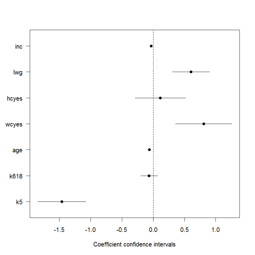
coefplot(fm, parm = -1)

Here is the resulting graph:

I hope Achim will get around to improve the function so he might think it worthy of joining his"lmtest" package. I am glad he shared his code for the rest of us to have something to work with in the meantime 🙂

* * *

Update (07.07.10):
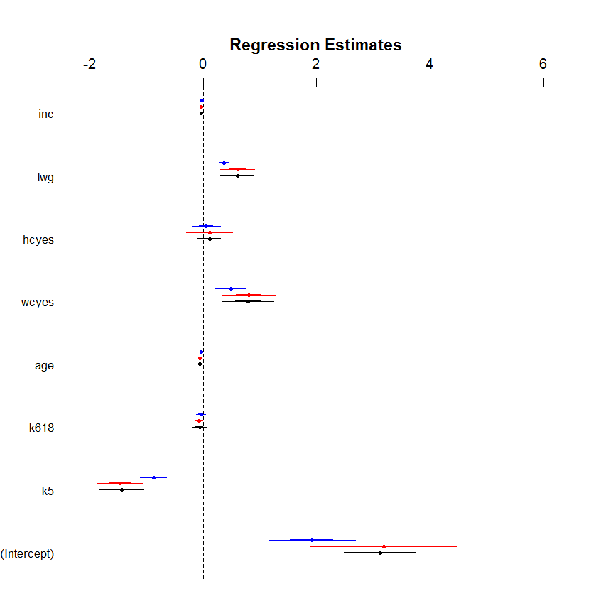
Thanks to a comment by David Atkins, I found out there is a more mature version of this function (called coefplot) inside the {arm} package. This version offers many features, one of which is the ability to easily stack several confidence intervals one on top of the other.

It works for baysglm, glm, lm, polr objects and a default method is available which takes pre-computed coefficients and associated standard errors from any suitable model.

Example:
(Notice that the Poisson model in comparison with the binomial models does not make much sense, but is enough to illustrate the use of the function)

library("arm")
data("Mroz", package = "car")
M1<-      glm(lfp ~ ., data = Mroz, family = binomial)
M2<- bayesglm(lfp ~ ., data = Mroz, family = binomial)
M3<-      glm(lfp ~ ., data = Mroz, family = binomial(probit))
coefplot(M2, xlim=c(-2, 6),            intercept=TRUE)
coefplot(M1, add=TRUE, col.pts="red",  intercept=TRUE)
coefplot(M3, add=TRUE, col.pts="blue", intercept=TRUE, offset=0.2)

(hat tip goes to Allan Engelhardt for help improving the code, and for Achim Zeileis in extending and improving the narration for the example)

Resulting plot

* * *
Lastly, another method worth mentioning is the Nomogram, implemented by Frank Harrell'a rms package.
Nutritional supplements efficacy score – Graphing plots of current studies results (using R)

In this post I showcase a nice bar-plot and a balloon-plot listing recommended Nutritional supplements , according to how much evidence exists for thier benefits, scroll down to see it(and click here for the data behind it)
* * * *
The gorgeous blog “Information Is Beautiful” recently publish an eye candy post showing a “balloon race” image (see a static version of the image here) illustrating how much evidence exists for the benefits of various Nutritional supplements (such as: green tea, vitamins, herbs, pills and so on) . The higher the bubble in the Y axis score (e.g: the bubble size) for the supplement the greater the evidence there is for its effectiveness (But only for the conditions listed along side the supplement).

There are two reasons this should be of interest to us:

  1. This shows a fun plot, that R currently doesn’t know how to do (at least I wasn’t able to find an implementation for it). So if anyone thinks of an easy way for making one – please let me know.
  2. The data for the graph is openly (and freely) provided to all of us on this Google Doc.

The advantage of having the data on a google doc means that we can see when the data will be updated. But more then that, it means we can easily extract the data into R and have our way with it (Thanks to David Smith’s post on the subject)

For example, I was wondering what are ALL of the top recommended Nutritional supplements, an answer that is not trivial to get from the plot that was in the original post.

In this post I will supply two plots that present the data: A barplot (that in retrospect didn’t prove to be good enough) and a balloon-plot for a table (that seems to me to be much better).

Barplot
(You can click the image to enlarge it)

The R code to produce the barplot of Nutritional supplements efficacy score (by evidence for its effectiveness on the listed condition).


# loading the data
supplements.data.0 <- read.csv("http://spreadsheets.google.com/pub?key=0Aqe2P9sYhZ2ndFRKaU1FaWVvOEJiV2NwZ0JHck12X1E&output=csv")
supplements.data <- supplements.data.0[supplements.data.0[,2] >2,] # let's only look at "good" supplements
supplements.data <- supplements.data[!is.na(supplements.data[,2]),] # and we don't want any missing data

supplement.score <- supplements.data[, 2]
ss <- order(supplement.score, decreasing  = F)	# sort our data
supplement.score <- supplement.score[ss]
supplement.name <- supplements.data[ss, 1]
supplement.benefits <- supplements.data[ss, 4]
supplement.score.col <- factor(as.character(supplement.score))
	levels(supplement.score.col) <-  c("red", "orange", "blue", "dark green")
	supplement.score.col <- as.character(supplement.score.col)

# mar: c(bottom, left, top, right) The default is c(5, 4, 4, 2) + 0.1.
par(mar = c(5,9,4,13))	# taking care of the plot margins
bar.y <- barplot(supplement.score, names.arg= supplement.name, las = 1, horiz = T, col = supplement.score.col, xlim = c(0,6.2),
				main = c("Nutritional supplements efficacy score","(by evidence for its effectiveness on the listed condition)", "(2010)"))
axis(4, labels = supplement.benefits, at = bar.y, las = 1) # Add right axis
abline(h = bar.y, col = supplement.score.col , lty = 2) # add some lines so to easily follow each bar

Also, the nice things is that if the guys at Information Is Beautiful will update there data, we could easily run the code and see the updated list of recommended supplements.

Balloon plot
So after some web surfing I came around an implementation of a balloon plot in R (Thanks to R graph gallery)
There where two problems with using the command out of the box. The first one was that the colors where non informative (easily fixed), the second one was that the X labels where overlapping one another. Since there is no "las" parameter in the function, I just opened the function up, found where this was plotted and changed it manually (a bit messy, but that's what you have to do sometimes...)

Here are the result (you can click the image for a larger image):

And here is The R code to produce the Balloon plot of Nutritional supplements efficacy score (by evidence for its effectiveness on the listed condition).
(it's just the copy of the function with a tiny bit of editing in line 146, and then using it)

Continue reading "Nutritional supplements efficacy score – Graphing plots of current studies results (using R)"