About Clustergrams
In 2002, Matthias Schonlau published in “The Stata Journal” an article named “The Clustergram: A graph for visualizing hierarchical and . As explained in the abstract:
In hierarchical cluster analysis dendrogram graphs are used to visualize how clusters are formed. I propose an alternative graph named “clustergram” to examine how cluster members are assigned to clusters as the number of clusters increases.
This graph is useful in exploratory analysis for non-hierarchical clustering algorithms like k-means and for hierarchical cluster algorithms when the number of observations is large enough to make dendrograms impractical.
A similar article was later written and was (maybe) published in “computational statistics”.
Both articles gives some nice background to known methods like k-means and methods for hierarchical clustering, and then goes on to present examples of using these methods (with the Clustergarm) to analyse some datasets.
Personally, I understand the clustergram to be a type of parallel coordinates plot where each observation is given a vector. The vector contains the observation’s location according to how many clusters the dataset was split into. The scale of the vector is the scale of the first principal component of the data.
Clustergram in R (a basic function)
After finding out about this method of visualization, I was hunted by the curiosity to play with it a bit. Therefore, and since I didn’t find any implementation of the graph in R, I went about writing the code to implement it.
The code only works for kmeans, but it shows how such a plot can be produced, and could be later modified so to offer methods that will connect with different clustering algorithms.
How does the function work: The function I present here gets a data.frame/matrix with a row for each observation, and the variable dimensions present in the columns.
The function assumes the data is scaled.
The function then goes about calculating the cluster centers for our data, for varying number of clusters.
For each cluster iteration, the cluster centers are multiplied by the first loading of the principal components of the original data. Thus offering a weighted mean of the each cluster center dimensions that might give a decent representation of that cluster (this method has the known limitations of using the first component of a PCA for dimensionality reduction, but I won’t go into that in this post).
Finally all of our data points are ordered according to their respective cluster first component, and plotted against the number of clusters (thus creating the clustergram).
My thank goes to Hadley Wickham for offering some good tips on how to prepare the graph.
Here is the code (example follows)
The R function can be downloaded from here
Corrections and remarks can be added in the comments bellow, or on the github code page.
Example on the iris dataset
The iris data set is a favorite example of many R bloggers when writing about R accessors , Data Exporting, Data importing, and for different visualization techniques.
So it seemed only natural to experiment on it here.
source("https://www.r-statistics.com/wp-content/uploads/2012/01/source_https.r.txt") # Making sure we can source code from github
source_https("https://raw.github.com/talgalili/R-code-snippets/master/clustergram.r")

data(iris)
set.seed(250)
par(cex.lab = 1.5, cex.main = 1.2)
Data <- scale(iris[,-5]) # notice I am scaling the vectors)
clustergram(Data, k.range = 2:8, line.width = 0.004) # notice how I am using line.width.  Play with it on your problem, according to the scale of Y.
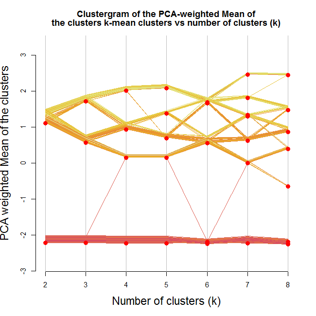
Here is the output:
Looking at the image we can notice a few interesting things. We notice that one of the clusters formed (the lower one) stays as is no matter how many clusters we are allowing (except for one observation that goes way and then beck).
We can also see that the second split is a solid one (in the sense that it splits the first cluster into two clusters which are not "close" to each other, and that about half the observations goes to each of the new clusters).
And then notice how moving to 5 clusters makes almost no difference.
Lastly, notice how when going for 8 clusters, we are practically left with 4 clusters (remember - this is according the mean of cluster centers by the loading of the first component of the PCA on the data)
If I where to take something from this graph, I would say I have a strong tendency to use 3-4 clusters on this data.
But wait, did our clustering algorithm do a stable job?
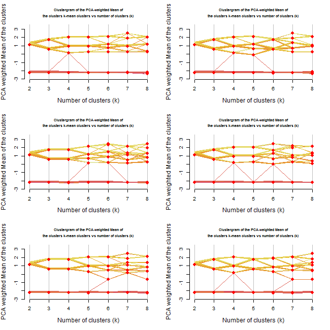
Let's try running the algorithm 6 more times (each run will have a different starting point for the clusters)
source("https://www.r-statistics.com/wp-content/uploads/2012/01/source_https.r.txt") # Making sure we can source code from github
source_https("https://raw.github.com/talgalili/R-code-snippets/master/clustergram.r")

set.seed(500)
Data <- scale(iris[,-5]) # notice I am scaling the vectors)
par(cex.lab = 1.2, cex.main = .7)
par(mfrow = c(3,2))
for(i in 1:6) clustergram(Data, k.range = 2:8 , line.width = .004, add.center.points = T)
Resulting with: (press the image to enlarge it)
Repeating the analysis offers even more insights.
First, it would appear that until 3 clusters, the algorithm gives rather stable results.
From 4 onwards we get various outcomes at each iteration.
At some of the cases, we got 3 clusters when we asked for 4 or even 5 clusters.
Reviewing the new plots, I would prefer to go with the 3 clusters option. Noting how the two "upper" clusters might have similar properties while the lower cluster is quite distinct from the other two.
By the way, the Iris data set is composed of three types of flowers. I imagine the kmeans had done a decent job in distinguishing the three.
Limitation of the method (and a possible way to overcome it?!)
It is worth noting that the current way the algorithm is built has a fundamental limitation: The plot is good for detecting a situation where there are several clusters but each of them is clearly "bigger" then the one before it (on the first principal component of the data).
For example, let's create a dataset with 3 clusters, each one is taken from a normal distribution with a higher mean:
source("https://www.r-statistics.com/wp-content/uploads/2012/01/source_https.r.txt") # Making sure we can source code from github
source_https("https://raw.github.com/talgalili/R-code-snippets/master/clustergram.r")

set.seed(250)
Data <- rbind(
				cbind(rnorm(100,0, sd = 0.3),rnorm(100,0, sd = 0.3),rnorm(100,0, sd = 0.3)),
				cbind(rnorm(100,1, sd = 0.3),rnorm(100,1, sd = 0.3),rnorm(100,1, sd = 0.3)),
				cbind(rnorm(100,2, sd = 0.3),rnorm(100,2, sd = 0.3),rnorm(100,2, sd = 0.3))
				)
clustergram(Data, k.range = 2:5 , line.width = .004, add.center.points = T)
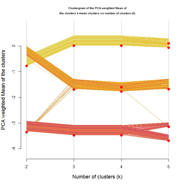
The resulting plot for this is the following:
The image shows a clear distinction between three ranks of clusters. There is no doubt (for me) from looking at this image, that three clusters would be the correct number of clusters.
But what if the clusters where different but didn't have an ordering to them?
For example, look at the following 4 dimensional data:
source("https://www.r-statistics.com/wp-content/uploads/2012/01/source_https.r.txt") # Making sure we can source code from github
source_https("https://raw.github.com/talgalili/R-code-snippets/master/clustergram.r")

set.seed(250)
Data <- rbind(
				cbind(rnorm(100,1, sd = 0.3),rnorm(100,0, sd = 0.3),rnorm(100,0, sd = 0.3),rnorm(100,0, sd = 0.3)),
				cbind(rnorm(100,0, sd = 0.3),rnorm(100,1, sd = 0.3),rnorm(100,0, sd = 0.3),rnorm(100,0, sd = 0.3)),
				cbind(rnorm(100,0, sd = 0.3),rnorm(100,1, sd = 0.3),rnorm(100,1, sd = 0.3),rnorm(100,0, sd = 0.3)),
				cbind(rnorm(100,0, sd = 0.3),rnorm(100,0, sd = 0.3),rnorm(100,0, sd = 0.3),rnorm(100,1, sd = 0.3))
				)
clustergram(Data, k.range = 2:8 , line.width = .004, add.center.points = T)
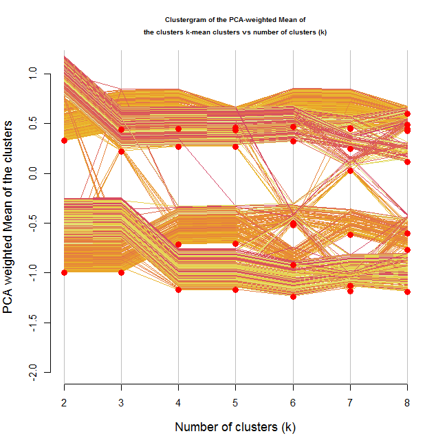
In this situation, it is not clear from the location of the clusters on the Y axis that we are dealing with 4 clusters.
But what is interesting, is that through the growing number of clusters, we can notice that there are 4 "strands" of data points moving more or less together (until we reached 4 clusters, at which point the clusters started breaking up).
Another hope for handling this might be using the color of the lines in some way, but I haven't yet figured out how.
Clustergram with ggplot2
Hadley Wickham has kindly played with recreating the clustergram using the ggplot2 engine. You can see the result here:
http://gist.github.com/439761
And this is what he wrote about it in the comments:
I’ve broken it down into three components:
* run the clustering algorithm and get predictions (many_kmeans and all_hclust)
* produce the data for the clustergram (clustergram)
* plot it (plot.clustergram)
I don’t think I have the logic behind the y-position adjustment quite right though.
Conclusions (some rules of thumb and questions for the future)
In a first look, it would appear that the clustergram can be of use. I can imagine using this graph to quickly run various clustering algorithms and then compare them to each other and review their stability (In the way I just demonstrated in the example above).
The three rules of thumb I have noticed by now are:
- Look at the location of the cluster points on the Y axis. See when they remain stable, when they start flying around, and what happens to them in higher number of clusters (do they re-group together)
- Observe the strands of the datapoints. Even if the clusters centers are not ordered, the lines for each item might (needs more research and thinking) tend to move together - hinting at the real number of clusters
- Run the plot multiple times to observe the stability of the cluster formation (and location)
Yet there is more work to be done and questions to seek answers to:
- The code needs to be extended to offer methods to various clustering algorithms.
- How can the colors of the lines be used better?
- How can this be done using other graphical engines (ggplot2/lattice?) - (Update: look at Hadley's reply in the comments)
- What to do in case the first principal component doesn't capture enough of the data? (maybe plot this graph to all the relevant components. but then - how do you make conclusions of it?)
- What other uses/conclusions can be made based on this graph?
I am looking forward to reading your input/ideas in the comments (or in reply posts).


