shinyHeatmaply – a shiny app for creating interactive cluster heatmaps

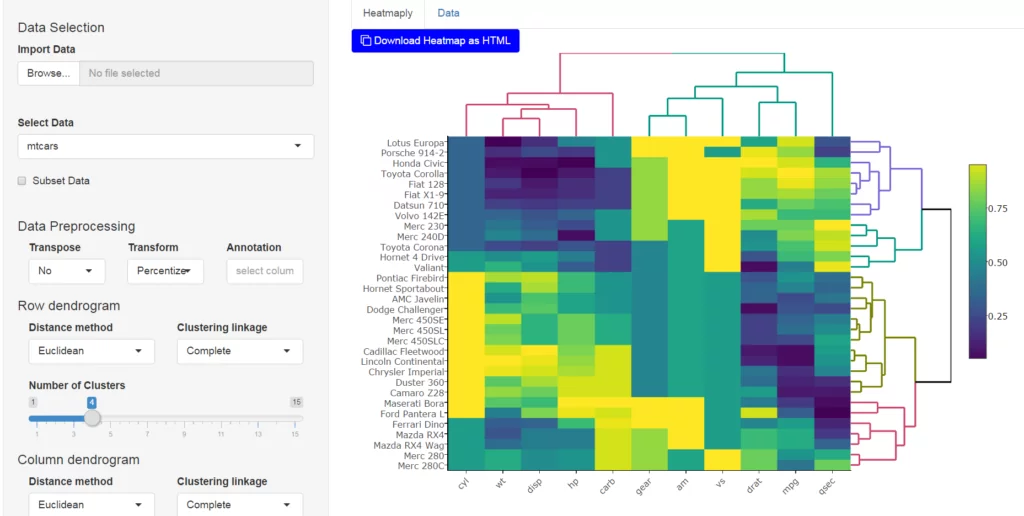
My friend Jonathan Sidi and I (Tal Galili) are pleased to announce the release of shinyHeatmaply (0.1.0): a new Shiny application (and Shiny gadget) for creating interactive cluster heatmaps. shinyHeatmaply is based on the heatmaply R package which strives to make it easy as possible to create interactive cluster heatmaps.

The app introduces a functionality that saves to disk a self contained copy of the htmlwidget as an html file with your data and specifications you set from the UI, so it can be embedded in webpages, blogposts and online web appendices for academic publications.

You can see some of shinyHeatmaply‘s capabilities in the following 40 seconds video:


Installing shinyHeatmaply

From CRAN:

install.packages('shinyHeatmaply')

From github:

devtools::install_github('yonicd/shinyHeatmaply')

Running the app/gadget

The application has an import interface as part of the application which currently supports csv, txt, tab, xls, xlsx, rd, rda. You can start the app using:

library(shiny)
library(heatmaply)
# If you didn't get shinyHeatmaply yet, you can run it through github:
# runGitHub("yonicd/shinyHeatmaply",subdir = 'inst/shinyapp')
# or just use your locally installed package:
library(shinyHeatmaply)
runApp(system.file("shinyapp", package = "shinyHeatmaply"))

The gadget is called from the R console and accepts input arguments. The object defined as the input to the shinyHeatmaply gadget is a data.frame or a list of data.frames. You can start it using the following code:

library(shinyHeatmaply)

#single data.frame
data(mtcars)
launch_heatmaply(mtcars)

#list
data(iris)
launch_heatmaply(list('Example1'=mtcars,'Example2'=iris))

You can see an example of a saved shinyHeatmaply output here. Or view the following iframe:

Continue reading “shinyHeatmaply – a shiny app for creating interactive cluster heatmaps”
Election tRends: An interactive US election tracker (using Shiny and Plotly)

Guest post by Jonathan Sidi

Introduction

The US primaries are coming on fast with almost 120 days left until the conventions. After building a shinyapp for the Israeli Elections I decided to update features in the app and tried out plotly in the shiny framework.

As a casual voter, trying to gauge the true temperature of the political landscape from the overwhelming abundance of polling is a heavy task. Polling data is continuously published during the state primaries and the variety of pollsters makes it hard to keep track what is going on. The app self updates using data published publicly by realclearpolitics.com.

The app keeps track of polling trends and delegate count daily for you. You create a personal analysis from the granular level data all the way to distributions using interactive ggplot2 and plotly graphs and check out the general elections polling to peak into the near future.

The app can be accessed through a couple of places. I set up an AWS instance to host the app for realtime use and there is the Github repository that is the maintained home of the app that is meant for the R community that can host shiny locally.

Running the App through Github

(github repo: yonicd/Elections)

#changing locale to run on Windows
if (Sys.info()[1] == "Windows") Sys.setlocale("LC_TIME","C") 

#check to see if libraries need to be installed
libs=c("shiny","shinyAce","plotly","ggplot2","rvest","reshape2","zoo","stringr","scales","plyr","dplyr")
x=sapply(libs,function(x)if(!require(x,character.only = T)) install.packages(x));rm(x,libs)

#run App
shiny::runGitHub("yonicd/Elections",subdir="USA2016/shiny")

#reset to original locale on Windows
if (Sys.info()[1] == "Windows") Sys.setlocale("LC_ALL")

Application Layout:

(see next section for details)

  1. Current Polling
  2. Election Analyis
  3. General Elections
  4. Polling Database

Usage Instructions:

Current Polling

  • The top row depicts the current accumulation of delegates by party and candidate is shown in a step plot, with a horizontal reference line for the threshold needed per party to recieve the nomination. Ther accumulation does not include super delegates since it is uncertain which way they will vote. Currently this dataset is updated offline due to its somewhat static nature and the way the data is posted online forces the use of Selenium drivers. An action button will be added to invoke refreshing of the data by users as needed.
  • The bottom row is a 7 day moving average of all polling results published on the state and national level. The ribbon around the moving average is the moving standard deviation on the same window. This is helpful to pick up any changes in uncertainty regarding how the voting public is percieving the candidates. It can be seen that candidates with lower polling averages and increased variance trend up while the opposite is true with the leading candidates, where voter uncertainty is a bad thing for them.

Snapshot of Overview Plot

Continue reading “Election tRends: An interactive US election tracker (using Shiny and Plotly)”